Wednesday, October 19, 2011
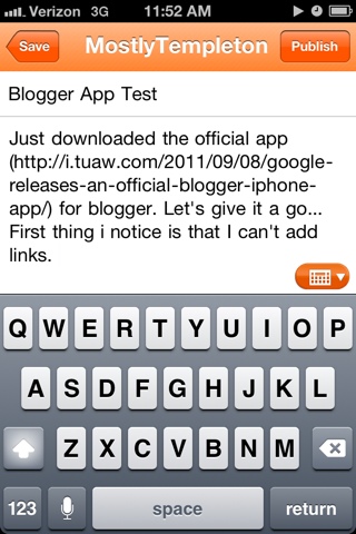
Blogger App Test
Just downloaded the official app (http://i.tuaw.com/2011/09/08/google-releases-an-official-blogger-iphone-app/) for blogger. Let's give it a go... First thing i notice is that I can't add links unless you know html. You can take a photo right from the app and load images from your camera roll. You can edit old posts. As far as I can tell you can't schedule posts either. With Facebook, instagram, and all the other services that easily let you share from your phone I don't see myself using this much. But it will be better for moblogging and keeping Verizon's extra text off my blog.
Wednesday, August 17, 2011
New Logo Idea
 I'm still pretty happy with the existing Mostly Skateboarding logo but have been feeling the need for a square logo for places that need squares like Twitter. As with most of my personal projects I spent months just thinking about it then was inspired by this Rebranding of Rhyl and thought I could adapt the scroll to a square(ish) logo for Mostly Skateboarding.
I kept the green/black/white color scheme I've had for along time. The original logo is in Futura Medium, so I used an italics version of Futura to put the letters on an angle. My favorite part of the logo is using the O to make the shape of a skateboard deck, so I kept that in this new logo.

This second example is more square but the ends of the scroll seem a bit too small. Maybe I should not have the notch cut out of the end... It still needs some work. I tried stretching the word Skateboarding to make it take up more of the scroll, but that ended up looking wonky. If you have any suggestions please let me know in the comments. If you're interested, here is my previous entry about the evolution of the Mostly Skateboarding logo.
Tuesday, July 26, 2011
Tuesday, May 24, 2011
Saturday, May 21, 2011
Wednesday, March 16, 2011
Donating blood
Definately need to mak an appointment next time.
This message has been sent using the picture and Video service from Verizon Wireless!
To learn how you can snap pictures and capture videos with your wireless phone visit www.verizonwireless.com/picture.
Note: To play video messages sent to email, Quicktime@ 6.5 or higher is required.
Friday, February 25, 2011
Kitchen Clock/Timer
 This is clock is so cool with it's built in timer. it is from the MoMA's Counter Space: Design and the Modern Kitchen exhibit. Studio 360 had a good story about the Frankfrt Kitchen that is also in this exhibit. It is embedded below.
Friday, February 18, 2011
Wednesday, January 19, 2011
Subscribe to:
Comments (Atom)


